Neuro Drink

Light It Up with melatonin.

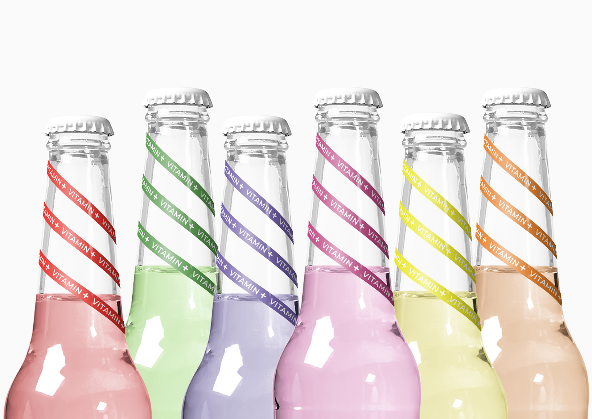
If you’ve never had a Neuro Drink, or don’t know what Neuro is, keep listening. This stuff is going to blow up, and it’s going to blow up in a big, big way. America has a new genius for packaging. The latest is a line of ‘Neuro’ drinks that deliver nutrients for specific purposes—in a vibrant rainbow of colors. The ‘neuro-sleep’ drink, for instance, is packed with melatonin, the hormone your body produces to help you sleep.

Quilmes Aluminum

Argentinean’s favorite beer revolutionizes once again its category, launching this new aluminum bottle, which changes its graphic when exposed to ultraviolet light. This unique and surprising characteristic has been magnified thanks to an attractive and original design, regardless the light you see it under.Adrian Pierini, Pierini Partners’ CEO and designer of this packaging which surprises consumers and collectors, said about the piece: “There are moments in the professional life when the ability to create is put to the test. This project generated the ideal situation in which imagination and resources could join and cause an interactive piece. The challenge was to transcend the graphic aspect and to generate a surprise element, a visual and tactile stimulation, a magic and fantastic piece. Undoubtedly, this bottle represents more than a launching; it is a symbol of leadership and innovation that only a brand like Quilmes could have.”  The graphic proposal consisted on covering, with a delicate texture of little silver mosaics, the body of the bottle. By this means, the coldness of the material was counteracted and, on the other side, its lightness was taken to the extreme. These little mosaics alter the chromatic palette in the central part of the pack creating, with the combination on different blues, the letter “Q”, synthesis of the beer logo.Even though these visual resources have transformed a static and functional object into a beautiful piece of design, the true magnitude of the proposal is best seen in the dark.Actually, although it seems paradoxical, the main attraction of the bottle is not noted at first sight. It is necessary to see it under ultraviolet light to discover the “spirits of fun and meetings” hidden on the surface of the bottle.Pierini mentioned about the creative process: “The complexity was to create a bi-functional design. Both designs, the one seen at a normal light, and the one appreciated with the ultraviolet light, have to have certain synergy. The ink used for the light reaction imposed certain conditionings, being the most important that no other ink can touch it. This limitation was overcome successfully thanks to the “kaleidoscope” design which has internal lines. With these, we created the silhouettes”.Imagination, technology and innovation. Those three words could synthesize the ingredients needed to achieve such a magnificent result as the obtained. Cervecería y Maltería Quilmes demonstrated once again, with these launching, that their desire to evolve is really strong. That is why consumers enjoy this beer, which is not only of high quality, but a synonym of trend as well.
Capi Sparkling

Created by CIP Creative

The CAPI brand was born from a simple idea to produce Pure, Clean, Refreshing carbonated drinks.

Taking on the sourcing and blending responsibilities themselves they have secured the finest natural extracts and botanicals worldwide to ensure their promise of authenticity. Capi Beverages were after a bold new look for their new Capi Sparkling range. The new premium range included Mixers, Fruit Sodas, and Mineral Waters and prides itself on the quality of ingredients it has sourced from around the globe. The result is Premium Refreshment. CIP Creative was engaged to create a Strong Brand Mark and distinctive packaging. When creating the brand and associated labels, we aimed for a crisp, fresh, no-nonsense visual language pulled together by a sharp logotype.

Our Business Bottle

Created by Ampro design consultants, from Romania. The “DESIGN BUSINESS BOTTLE” was made to capture the essence of our business in connection with the client's business, and that's why we designed a bottle with 2 necks: one for us, and one for the client, after all, aren't we all drink from this business? And the story is like this: “Let's make a gift for every contract we sign...let's make a good wine bottle”, and we did: the bottle has 2 necks covered by 2 glasses: one written “OUR BUSINESS” and the other: “YOUR BUSINESS”, because, as a client, you put a little of your business in our business, and in the end, you will enjoy the sweet wine inside.

Belvoir Fruit Farms

\

\

\

\

\

\

\

\

Big Fish Design created these beautiful packages for Belvoir Fruit Farms. The typography and colourful labels created to differentiate the brand from its competitors. In the first year, Belvoir produced 500 bottles. Today about 8 million of bottles with juices have been produced annually. Design sells. Great work!

Coca-Cola Mystic

coke_mystic.jpg

Coca - Cola MYSTIC by jerome olivet. Mystic surprised by its beauty and intensity.
 It was created to live an intense and fleeting moment.
Its racy style describes a supernatural world that soars skyward.
Its skin has a sculpted unique spiritual experience. We discover in the palm of our hand soft and aerodynamic forms.
Its living surface is shaped by a force mysterious and transparent. It send us all the energy and excitement of Coca-Cola
Its sexy lines and red color give happiness in 3 dimensions. Both organic shapes intertwine and form a body ambiguous and fascinating.
Its loving silhouette, ties into a true popular poetry.

DQ Vodka

DQ Vodka’s unique bottle is made by one of the finest glassmakers in Europe. The metal surfaces of the parts are produced to high-quality automotive standards. The finish for the top and bottom caps is satin chrome. More images after jump>>Instead of cluttering the beautiful DQ Vodka bottle with a long description of our production process, we chose to tell this story through five distinct symbols on the base of the bottle. Every bottle of DQ is branded with our unique "Hallmarks of Quality". Not only do they tell the Made Undiluted story of DQ, but they are even proof that the product you are buying is an authentic, high-quality product from the DQ factory in Malmköping, Sweden.DQ is distilled in the government-protected Malmköping springs, a feature that formed almost two million years ago. The water here is naturally soft, filtered and fortified. In the Nordic Spirit bottling plant, a connecting pipeline to the natural springs allows them to blend their distilled DQ spirit with this purified water, close to the source. Our idea ‘Life undiluted’ speaks to an emerging group of consumers who are tired of being told what to do, how to act, or what luxury looks like. These are consumers who want to live life on their own terms, undiluted by trends or the expectations of others. At the same time, ‘Life undiluted’ reflects the purity of DQ – the only Swedish winter wheat vodka undiluted with inferior grains.

94Wines: wine by numbers

Paint by numbers for kids...why not wine by numbers for adults? Searching the internet last night, I came across a great idea out of the Netherlands. A classy product with a digital take to it brings French wine into future. Dutch startup 94wines is now bringing a new technological twist to the table by offering a line of numbered and colour-coded wines that can be personalized with digital contentLaunched a week ago, 94wines offers a line of French wines in which each variety is indicated by a number and a bottle colour rather than a name linked to its maker, vintage or region. Consumers begin by taking a short quiz of six questions regarding their likes and dislikes. That, in turn, produces their personal WineID, which can then be used to guide their choices from among the company's series of wines. The use of numbers and colours makes wine preferences easy to remember, while personal ID profiles allow friends to see each other's preferences for gift-giving purposes.Perhaps even more interesting, 94wines customers can attach electronic content to any bottle of wine. Upon placing an order, they simply upload a text, photo or video file (one is allowed per bottle of wine), which 94wines stores on its server. 94wines then converts that content into a QR code, which it attaches to the bottle. (QR codes are included on all 94wines bottles, so if consumers don't upload their own content, the company includes a standard message instead.) Recipients can view the attached content using their mobile phone's camera or by entering the code at 94wines.com. There's also a free 94wines application for iPhones that includes an advanced QR reader along with the WineID test, an overview of the 94Wines assortment and the ability to view the profiles of friends. Per-bottle pricing at 94wines ranges between EUR 5.99 and EUR 9.99, with no extra charge for personalization.A big thank you to http://www.springwise.com for some additional content.

Packaging Collection 16

Over the past few years, CREATEiD has gathered a large collection of packaging from around the world. We will be posting these images on an ongoing basis. If you know the agency or any background information relating to any posts, please contact me.

Packaging Apothecary

Packaging Apothecary is a historical look at some designs from the 15th-century medical profession.  Throughout these designs, you can see influences carried into modern package designs that we see today, These design cues give the brand a look and feel of a truly skilled practitioner. Enjoy!

Method – People Against Dirty

Truly, innovative package design. “10 years ago, Eric Ryan and Adam Lowry decided on a course of action that was not unlike David taking on Goliath.  That is when they launched Method; at that time, cleaning products were one of the most stagnant and conventional categories around. Now, thanks to partnerships with Karim Rashid for packaging designs and Crispin Porter + Bogusky (CP+B) for marketing, Method has found a welcome niche for the forward-thinking and forward-looking product line.” Here are but a few examples of some truly market-changing designs.