Frai Beverages

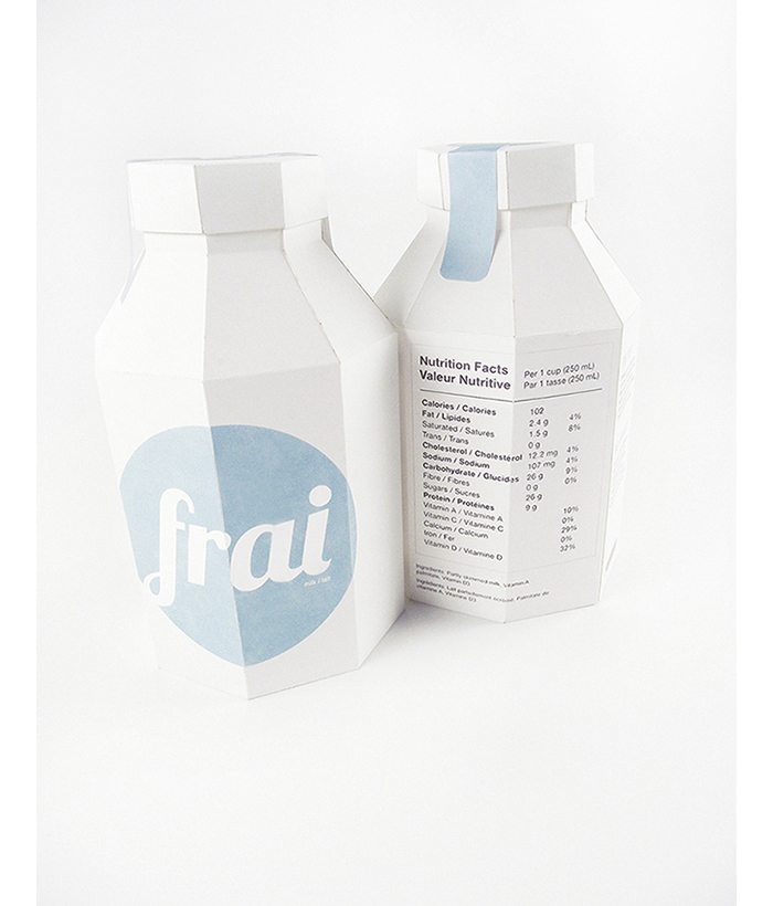
Frai milk and juice cartons is a student project meant for a Canadian audience since the text on the packages is written in both French and English. They are 100% recyclable with a minimal design that allows them to stand out on shelves.Frai is a brand for a series of juice and milk carton designs. These 100% recyclable packages have text in both English and French in order to sell to a Canadian audience. This package series contains a blue milk carton, a brown chocolate milk carton, and a yellow juice carton. The juice carton is taller and thinner in order to differentiate it from my inspiration of an old metal milk container. The minimalist design of the front of the packages will distinguish them on shelves from other current designs.

Created by Cassandra Cappello.

Young’s Seafood: Student Project

Created by Emily Myers

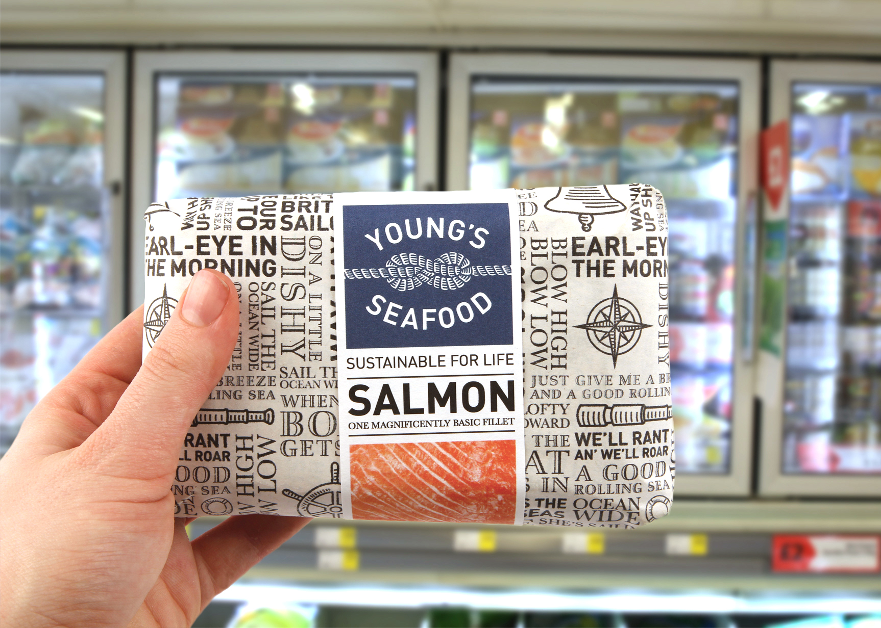
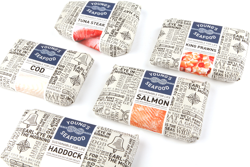
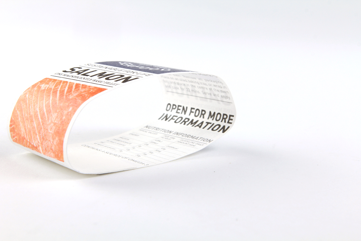
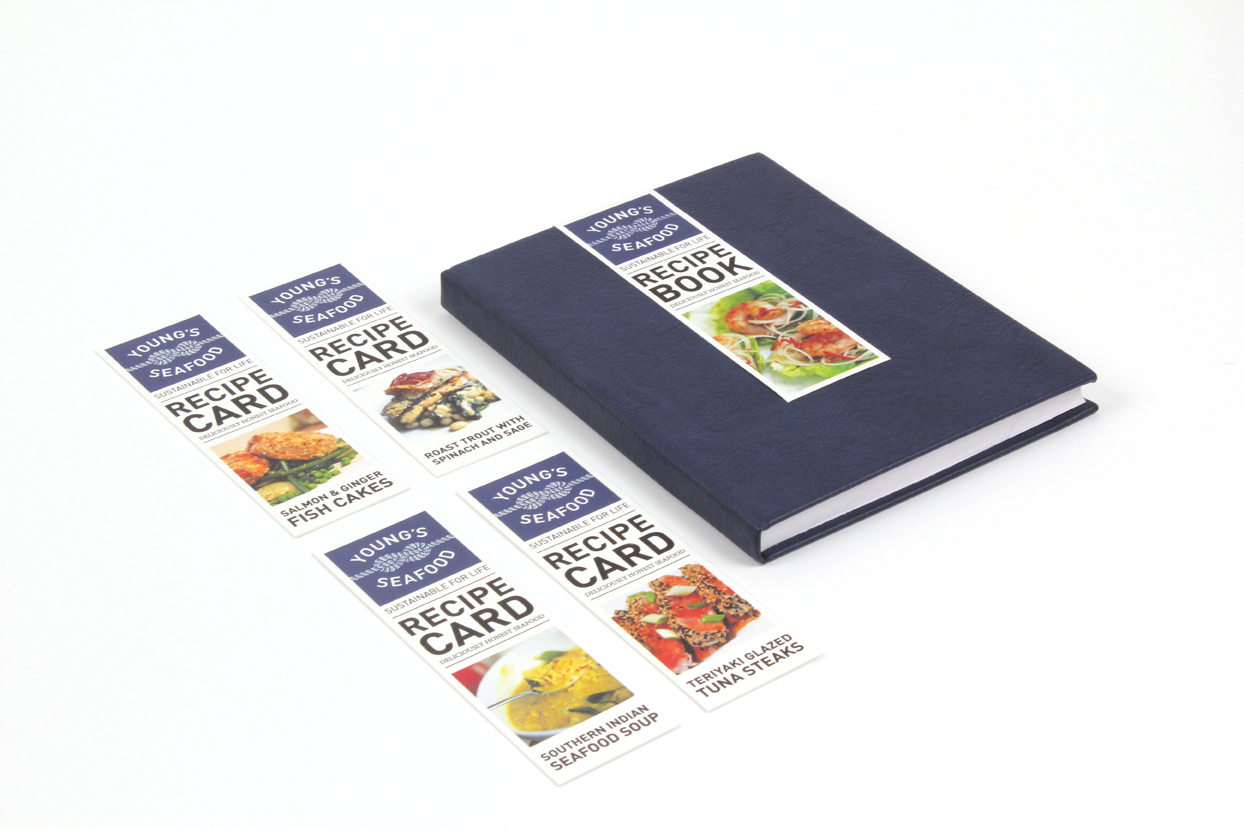
Rebrand of Young’s Seafood, the UK’s leading branded producer and distributor of seafood. With the heritage and experience of over 200 years, they understand the importance of sustainability within their trade. The new brand respects the nautical heritage of Grimsby, which was once the largest and busiest fishing port in the world. The logo is a Figure 8 knot, a nautical stopper knot, giving implications of protection, strength and durability, reflecting the brand’s message. The tiled pattern of sea shanties, strong and repetitious work songs, accompany Young’s Seafood in their future labor towards sustainability.

Student Work: L’Artisan Parfumeur Epiphany

Created by Emily Myers and Rebecca Clarke, for a D&AD student competition for L’Artisan Parfumeur. The brief was to re-envisage the L’Artisan Parfumeur brand for the 21st Century by creating a design solution for a new unisex range of scents.The four scents in the range were uniquely based around bottled emotions, each capturing a different human feeling. Emotions are complex and cannot be explained through words; they must be experienced to be understood. Epiphany perfume provides an interactive experience conveying each emotion through colour and movement. The exterior packaging is minimal and intriguing, contrasting with the surprising experience on the inside. The use of incomplete letters reflects the idea that emotions can’t be put into words. The bottles are heat reactive, with the heat from your hand activating the smoke inside. The perfume atomises in a smoke-like formation, enabling it to be visible and expressive. The Epiphany collection can only be experienced once purchased, complimenting L’Artisan Parfumeur’s luxurious and exclusive character.

Teekanne Tea

This project from Christopher Walser  and Martin Strobel in cooperation with the Vorarlberg University of Applied Sciences and the „Teekanne GmbH Austria“ as a school project to re-brand the tea company.Brief: Currently the benefits of tea can only be experienced at home. If the advantages of tea consumption and healthy mobility are brought together, you will get the best possible relaxation and the most intense tea experiences. We created a tea experience for a mobile generation.Being mobile means, to be active and to be on the move – it means to enjoy the day together. We want "Teekanne“ to be a permanent part of these shared experiences. Tea consumption is no longer limited to a particular place or certain time. 

Always Tampons

Minneapolis-based graphic designer Heda Hokschirr. Hokschirr is a senior at the Maryland Institute College of Art, and for an assignment on redesigning a commercial brand, she decided to class up tampons with a sleek black box that has simple Roman letters on the outside and black-and-white patterns on the inside. A necessity should be beautiful. Definitely not something to be hidden under the bathroom sink! 

GE CFL Bulbs

Designed by Chul Lee, a senior at Art Center College of Design, with an emphasis in packaging and branding.With the support of General Electric's lighting supplies, Earth Hour is creating awareness by informing the consumers to replace their bulbs, save money on their bills as well as participate at the annual event by switching off the lights for one hour to help create awareness for global warming.The main attributes based around this rebranding and repackaging were:1. global 2. proud 3. responsible  4. unified 5. established 6. informative 

Krinka Sour Cream

Pavel Kulinsky a student that created this concept  line of sour cream packaging for the Ukrainian market. The concept name that Pavel chose was “Krinka” which translates to  jug for milk or sour cream in Ukrainian. " I thought that the form of traditional Ukranian jug would be nice package form for something like sour creame or milk package."

OR Organic Wine

Pavel Kulinsky is a student of British Higher School of art & design in Russia, Moscow brief was to make a bottle of wine for a painter girl who loves exotic, interesting in Asian culture and likes to travel. Inspired by my own travels, and especially South East Asia food-markets I decided to make “Or wine”) The wine is natural and based on insects as a legend. “Or wine” has no traditional separations by flavor or color, Instead it has separations by regions and countries where are the insects from.