Supreme Roastering

Supreme Roastering 01.jpg
Supreme Roastering 2.jpg
Supreme Roastering 3.jpg
Supreme Roastering 4.jpg
Supreme Roastering 5.jpg
Supreme Roastering 6.jpg
Supreme Roastering 7.jpg
Supreme Roastering 8.jpg
Supreme Roastering 9.jpg
Supreme Roastering 10.jpg

Created by Markaworks

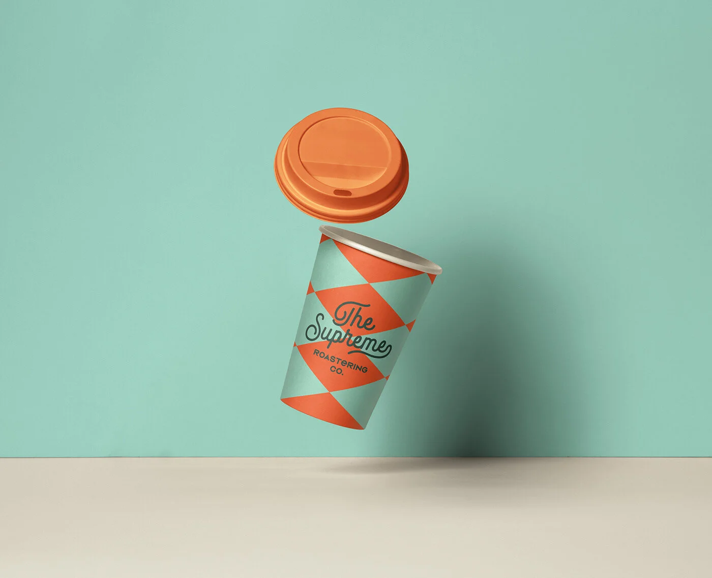
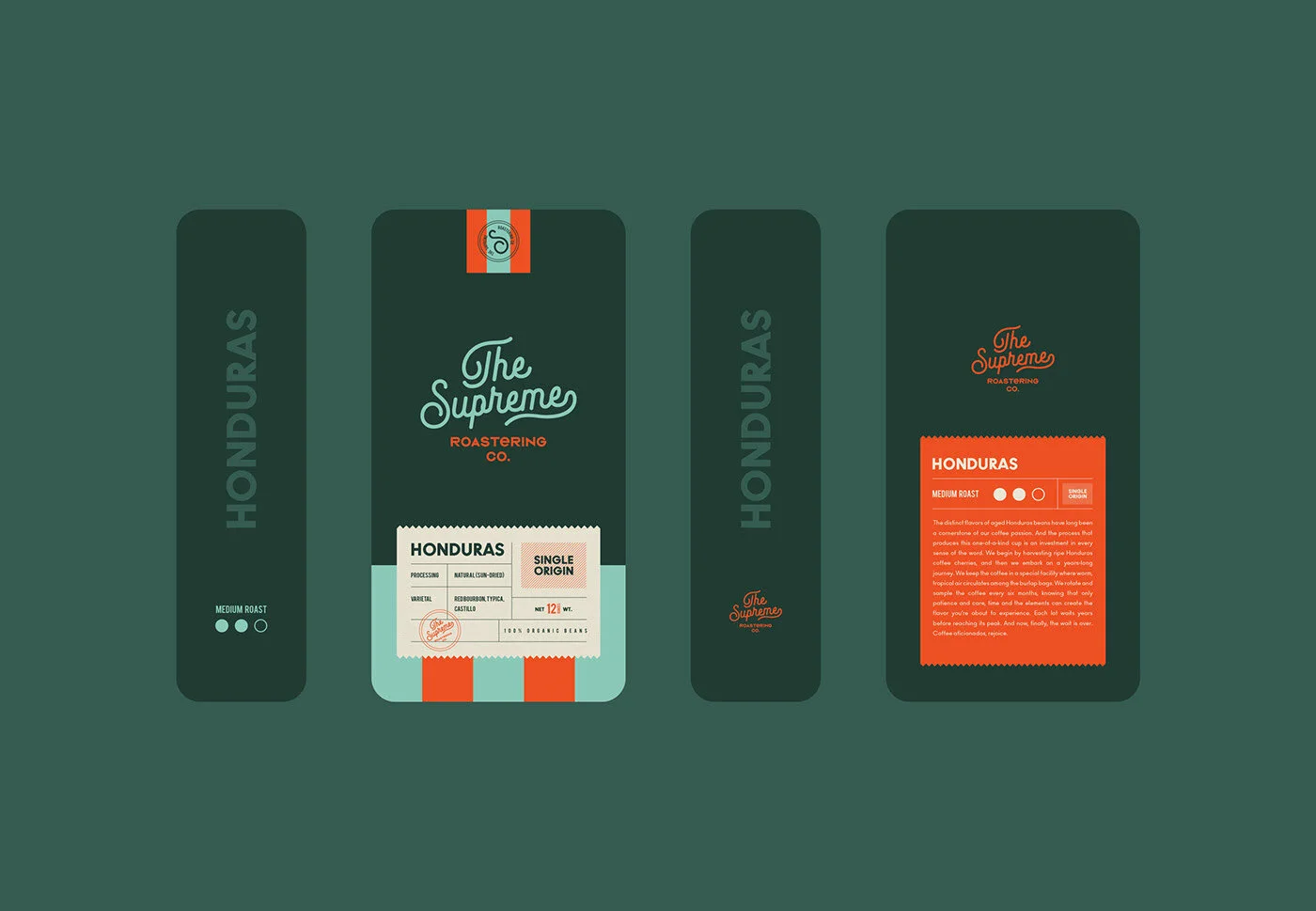
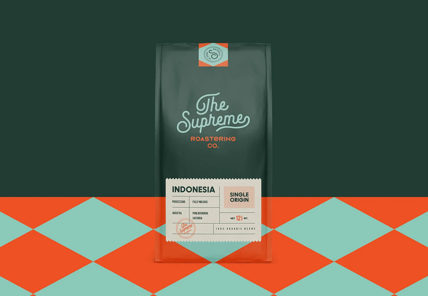
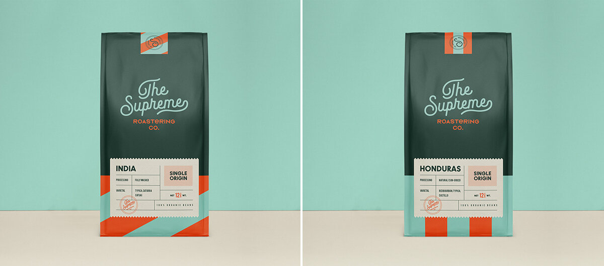
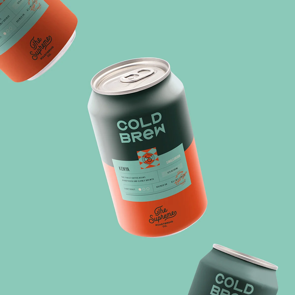
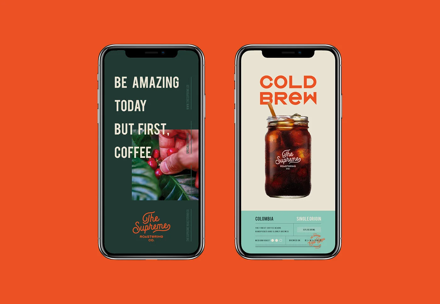
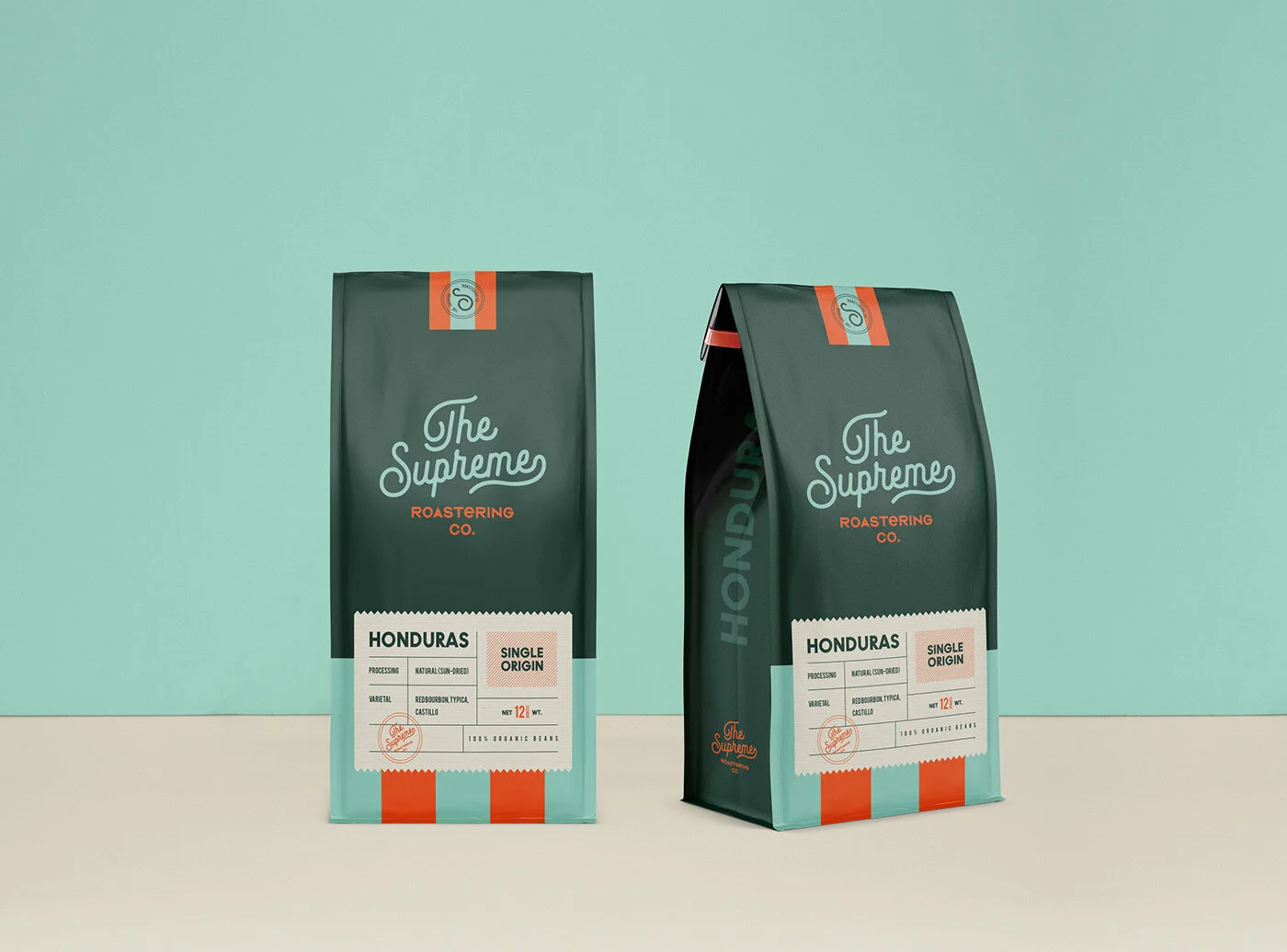
Creating a brand identity with a vintage and minimal approach for The Supreme Roastering Co. The inspiration for the colors of The Supreme comes from coffee beans. At the same time it was supported by orange tone in order to create contrast. We also used cream tone and soft colors alternatively. It is a vintage, simple and minimal branding / packaging project. We hope that you like it!

Bolgrad Classic Wine

Bolgrad Classic Wine 1.jpg
Bolgrad Classic Wine 2.jpg
Bolgrad Classic Wine 3.jpg
Bolgrad Classic Wine 4.jpg
Bolgrad Classic Wine 5.jpg
Bolgrad Classic Wine 6.jpg
Bolgrad Classic Wine 7.jpg
Bolgrad Classic Wine 8.jpg

Created by Reynolds and Reyner

Wine of Bolgrad is the drink with a rich history. It dates back to 1821 with the architecture of Bolgrad bearing witness to. The city hosted the vintage wine warehouse, one of the core enterprises of those times. So far, there are an extensive range of dessert, dry and semi-sweet wines distinguished with soft and easy taste within TM Bolgrad. The original bouquet is harmoniously combined with many dishes, fruit and delicate desserts, hard and soft cheeses making it a perfect match to cozy family leisure or large-scale banquets.

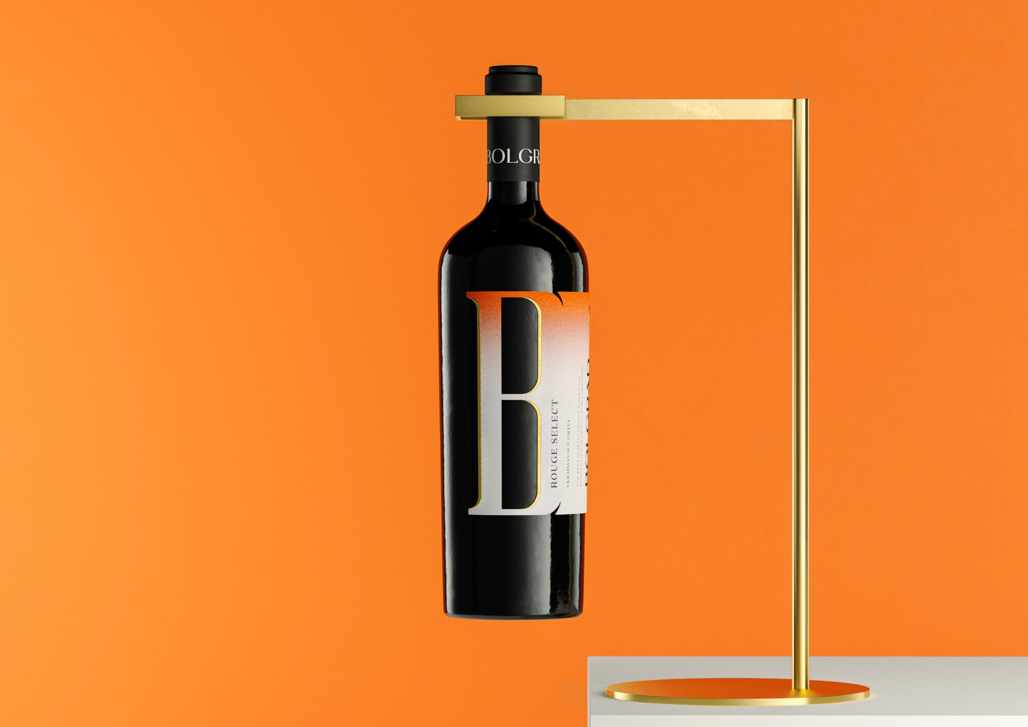
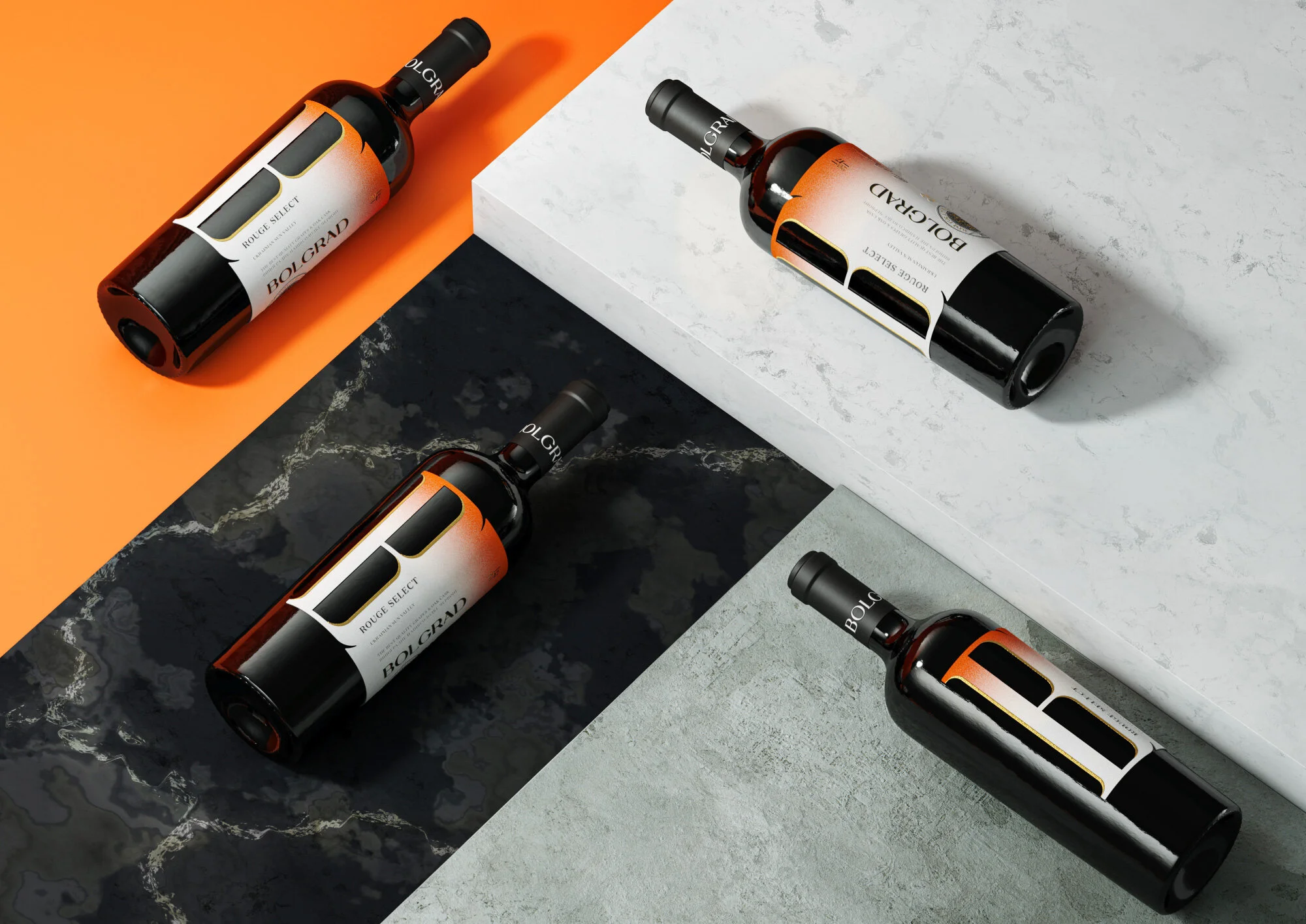
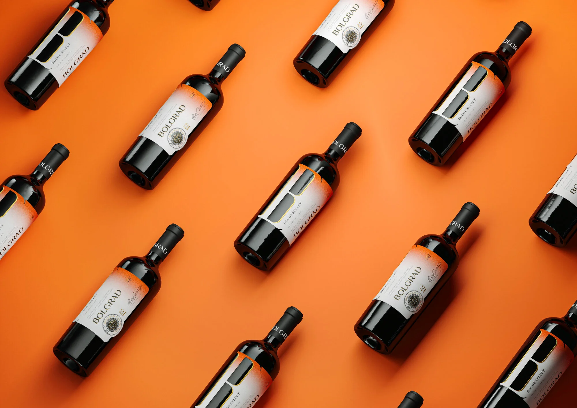
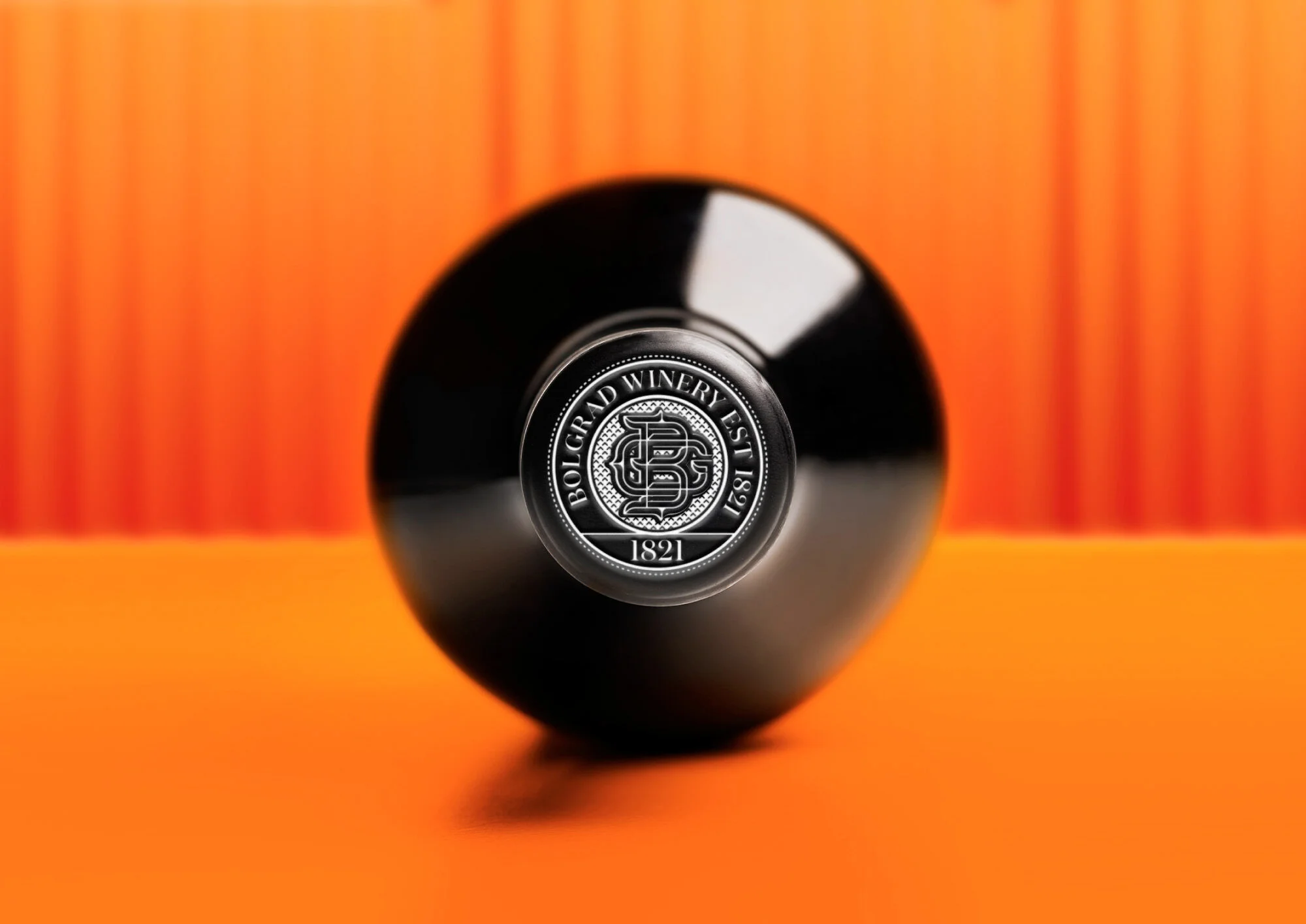
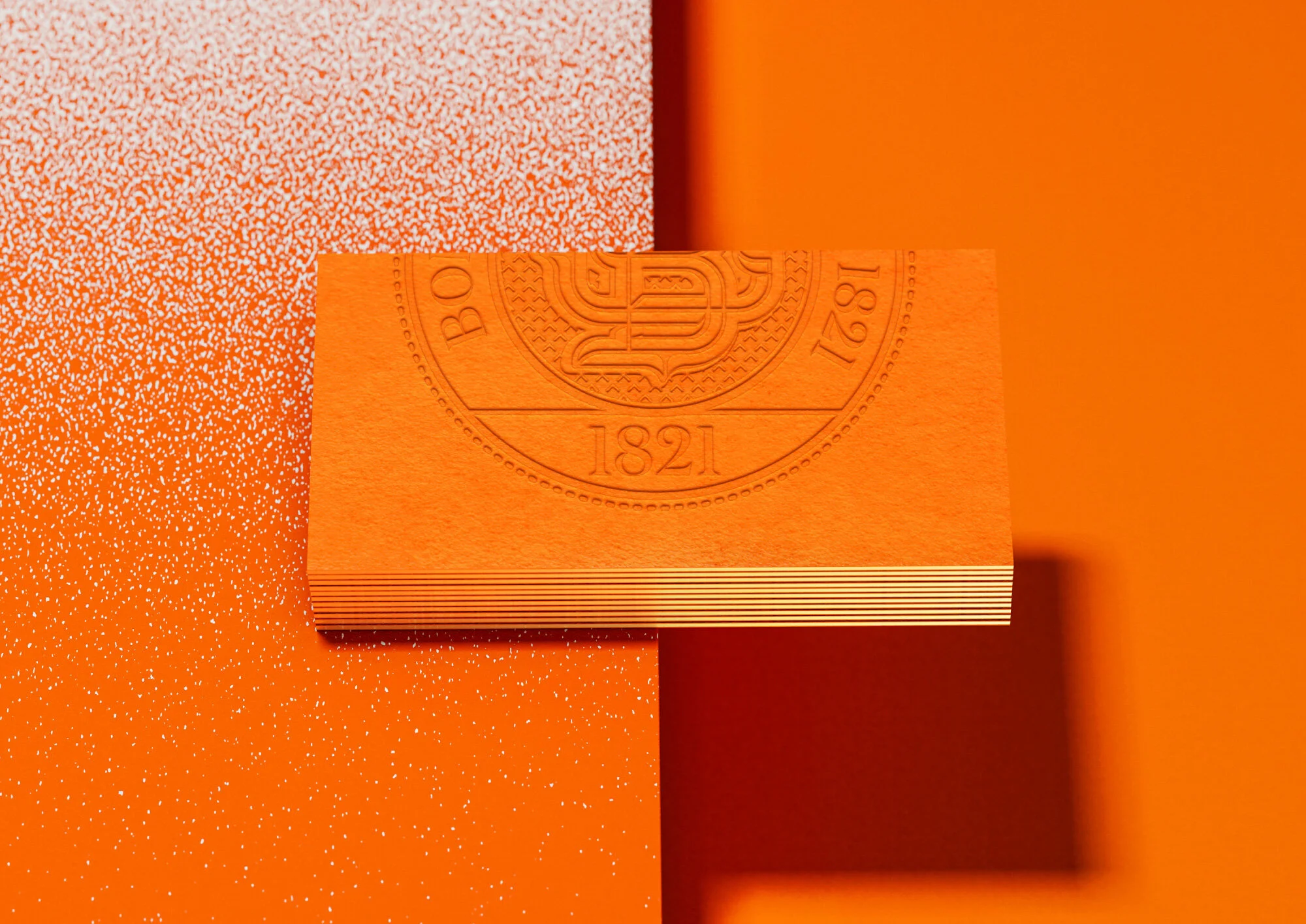
Redesign of TM Bolgrad started from a semi-sweet line, consisting of 12 types of wines. Within the frames of the project, the unique identity design was developed. It includes the company BG monogram, standing as an extra distinctive element of the brand, ‘Classic Collection’ manuscript signature, and the upgraded logo design. The key identity elements will form the redesign basis of all the products within the Bolgrad umbrella brand portfolio. It is the bottle that has undergone changes as well. A new masculine silhouette with wide shoulders and smoother transitions toward the bottleneck has been developed.

The capital letter ‘B’ unique label cut forms the core design element, and, combined with the new identity, stands as the powerful communication tool with the consumers and the competitors’ removing obstacle. Bolgrad wine means enjoyment for living without any rules and prejudice. No matter whether it is red or white wine, served with fish or Thai noodles, the most important is the company of dear close friends to share the unforgettable moments with. New modern tendencies never matter when one simply wants to enjoy the tasty wine.

Krave Jerky

KRAVE Jerky is an impressive line of on-the-go, artisan-quality meat snacks not only taste amazing, they are also quite good looking.At Hatch, they took inspiration from the product itself, breaking through category constraints with premium packaging that doesn’t take itself too seriously. It’s “pork without the fork” and “more macho than trailmix”. Krave Jerky beefy snacks are a tough item to miss on store shelves.

Tumult

Tumult is a new adult fermented non-alcoholic drink made by Coca-Cola that has been specially crafted to be consumed with food. It pairs particularly well with sushi according to the experts, and is a great alco-alternative when served as an aperitif.Intended to brighten up social moments, Taxi Studio reflected this sentiment in the redesigned packaging by bringing joy and movement into the visual identity to compliment Tumult’s tumultuous character.Spencer Buck, one of Taxi’s creative directors says,  “We wanted to open Tumult up to a wider audience, so when we embarked on the redesign the brief to ourselves was to make it much more visible on shelf, sexier in the hand and light-hearted overall. The new design uses lively colours and a swirling cloud device, which references the drink’s fermented, ‘alive’ quality’.Casey Sampson, Taxi’s senior designer says, “The device is called the ‘Sensorial Cloud’—as Tumult is a fermented non-alcoholic drink it’s basically alive, so we’ve attempted to bring that idea to life with the use of intricate swirls and swooshes which provides a lot of visual movement. Together with the refreshed logotype it’s now got a sense of permanence… a more iconic status.”Following on from the pack designs, Taxi Studio is now working on promotional and point of sale materials to communicate the brand benefits: 100% Freshness, 0% Added Sugar. The new Tumult packaging will initially launch in Paris next month.The Coca Cola Co has chosen France as the first launch market for its new 'brewed' soft drink, Tumult.The fermented, non-alcoholic drink is low-calorie and comes in 'fruit' and 'malt' flavours. It is pitched as an apéritif for consumers in the 30-45 age bracket, who appreciate good cuisine and restaurant dining.“Tumult has been wrongly described as an alcohol-free beer when in fact it is a sophisticated soft drink made from fermented fruit,” a Coca Cola France official told just-drinks today (11 August).For now, Tumult is only available in a few retail outlets in Paris. If successful it may launched nationwide and in other countries.

American Crew Gift Box

Created by Karsh Hagan

American Crew holiday gift boxes have to appeal to the women who buy them and the men who receive them. And they need to stand out on the cluttered salon shelf with a design that is both stylish and timeless. Here are a few highlights from the last three years of gift set design.

slice

Slice is all about style. Simplified and sophisticated product design and packaging are what they do, but they also have a great logotype and collateral to complete their brand personality. Using a simple slice or angled line on the logo and carrying it through to the collateral with minimal colors has a strong impact. 

Dr. NO Effects

BoomArtwork recently created the logo artwork and packaging design for DrNo Effects, a range of vintage guitar effect pedals. Eric says "It has been an absolute pleasure to work on this job as I always love to mix graphic design, custom lettering, and illustration. This project had all of these elements. I started by doing some rough sketches and created six different vintage styles, one for each guitar effect. Within each artwork, I tried to reflect the sound and style of the effect. I created custom letters to make every effect unique and special. Finally, I placed the sketches in Illustrator, traced them and added color." As I'm a guitar player myself I have to say these vintage guitar effects are truly amazing and really take you back in time. But I guess this goes without saying as Alain Johannes of Queens of the Stone Age is one of the many users of DrNo effects. The effects are produced using the best components and materials available, and every stompbox is 100% handmade by DrNo himself. For more info please follow this link: www.drno-effects.com

Santeen

The venerable Santeen brand needed a face-lift. With a sixty-year history of providing hardworking cleaning products, Santeen wanted to retain its authentic brand values while reinvigorating the brand for consideration by a contemporary audience. The new Santeen brand identity and packaging underscore the professional quality and high performance of its products coupled with company's enduring genuine American roots.Inspired by classic 1950's package design, the new brand language and package design by Studio MPLS conveys a sense of strength, pragmatism and work ethic with a no-nonsense yet modern graphic look and feel. The primary packaging also features a proprietary design that allows the product to be shelved and sold without the use of safety
bags—making the product more recognizable, convenient and affordable.