Vitamin Plus

VITAMIN_PLUS 1.png
VITAMIN_PLUS 2.png
VITAMIN_PLUS 4.jpg
VITAMIN_PLUS 5.jpg
VITAMIN_PLUS 6.jpg
VITAMIN_PLUS 7.png
VITAMIN_PLUS 3.png
VITAMIN_PLUS 8.png

Created by Sasha Design

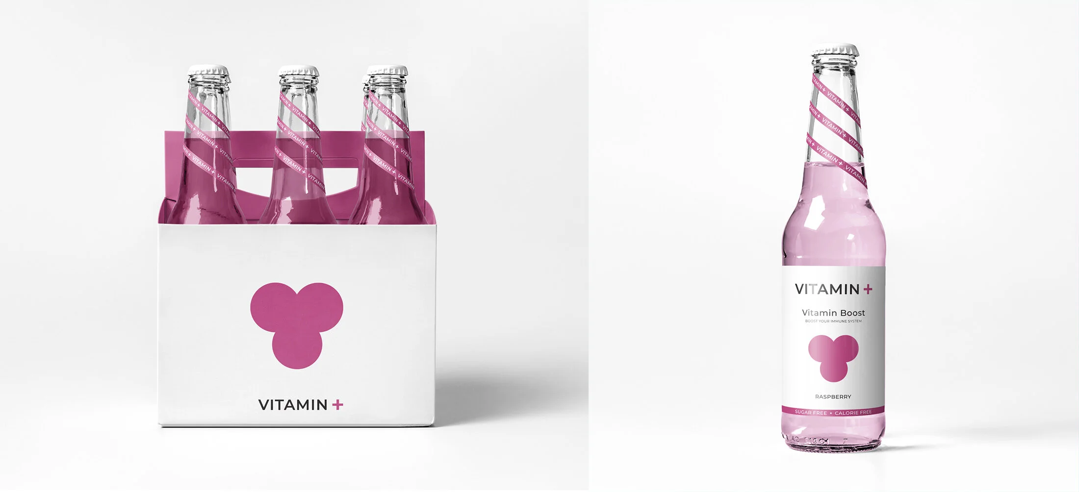
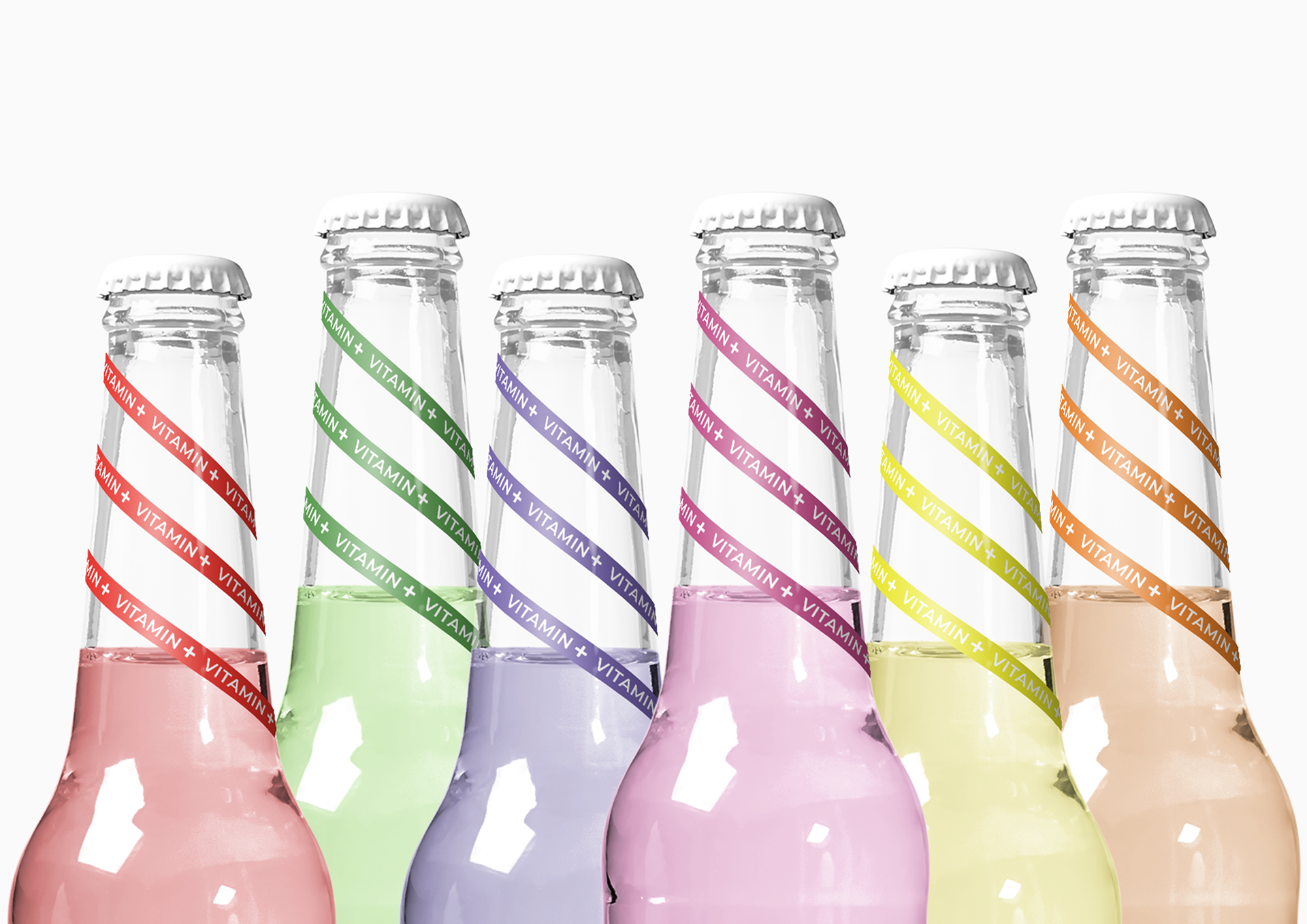
Vitamin + is a school project where my task was to create the identity and packaging for beverages of my choice. I wanted to make something simple and minimalist, but something that would be eye-catching and stand out on the shelves among other beverages. Using geometric shapes and colors, I tried to convey the message in a slightly different and creative way.


Kelloggs Reclaim

Kellogg_reclaim 2.jpg
Kellogg_reclaim 4.jpg
Kellogg_reclaim.jpg
Kellogg_reclaim 3.jpg
Kellogg_reclaim 1.jpg

Created by Landor

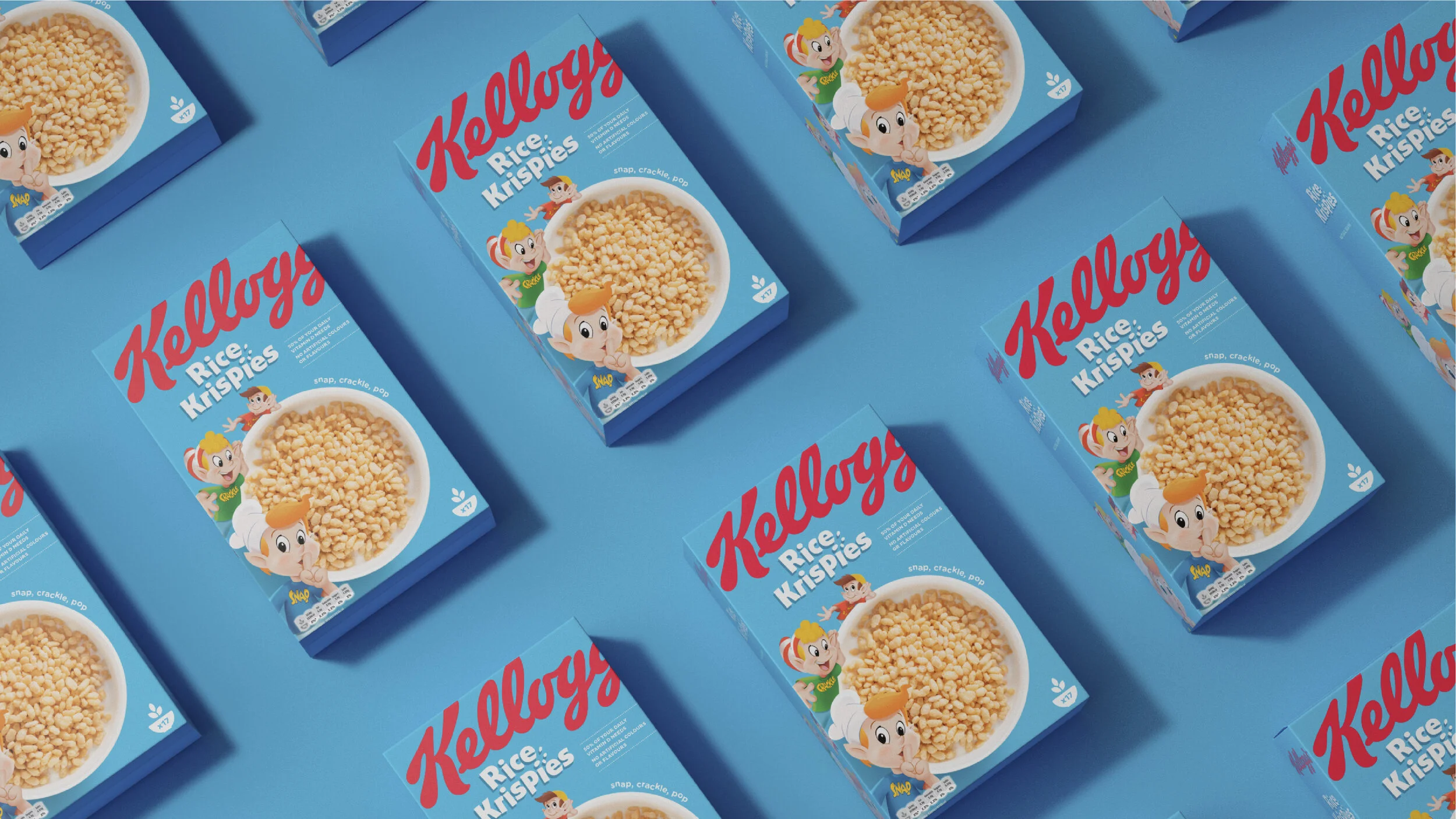
“ to help Kellogg’s stand out from the crowd, we determined that it could leverage two trends aligned with its heritage: the quest for simplicity and the desire to live well. This led us to a very clear strategy: address the shift to healthier habits by using the Kellogg’s master brand to tell the story of natural grain goodness in a simple and honest way and reclaim its widely recognized assets.

We started by simplifying the packaging, building on the inherent strength of the most powerful brand elements. We updated the distinctive Kellogg’s logo, cropping the wordmark to demonstrate that, even with 100+ years of history, Kellogg’s remains playful and fun. The eye-catching new color palette takes inspiration from fresh, natural ingredients such as vibrant red strawberries and deep purple grapes. The portfolio is now visually brighter, with a wider and more cohesive palette that makes packages stand out dramatically on the shelf.

Regaining category leadership: Our clean, cutting-edge pack design speaks to changing consumer trends. Research results showed that nearly 70 percent of consumers were able to find the new packs on the shelf more easily, and the new designs increased purchase intent by almost 50 percent.

Paul Humphries, vice president of marketing of Kellogg’s Europe, said, “Kellogg’s is one of the world’s most recognizable brands and our cereal boxes are a staple of most people’s breakfast tables. By marrying the best in design with the best cereals, we’re confident our new packs will be a real showstopper on supermarket shelves.”

P.R.I.M.V.S

PRIMVS SET 2.jpg
PRIMVS SET 1.jpg
PRIMVS SET 4.jpg
PRIMVS SET 3.jpg
PRIMVS SET.png

Created by NTGJ

P.R.I.M.V.S is a brand that has upped the ante in a number of consumer sectors and has initially turned its attention to food — a sector that has, for too long, been looked upon as merely a necessity of life and requires limited in-depth packaging design.

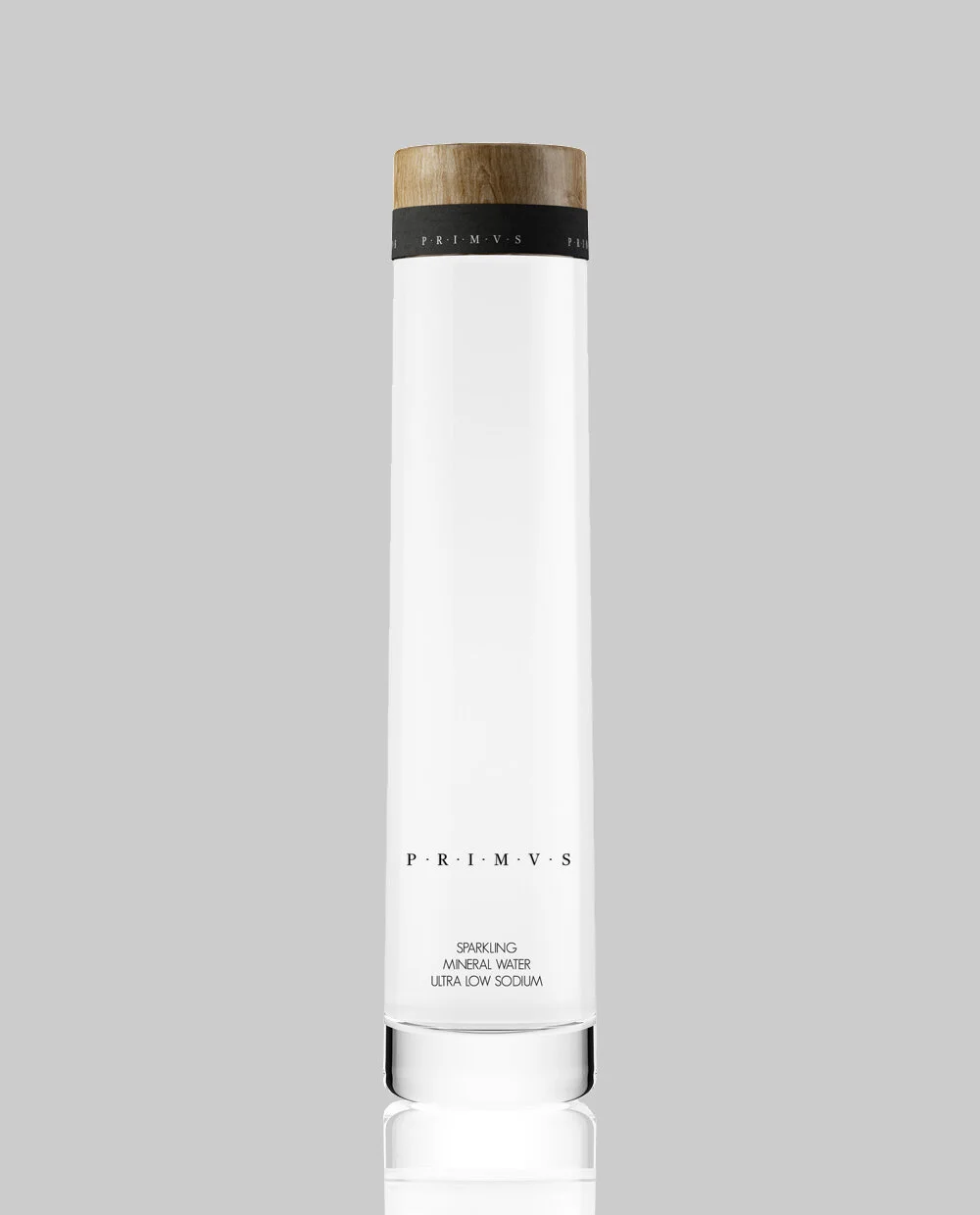
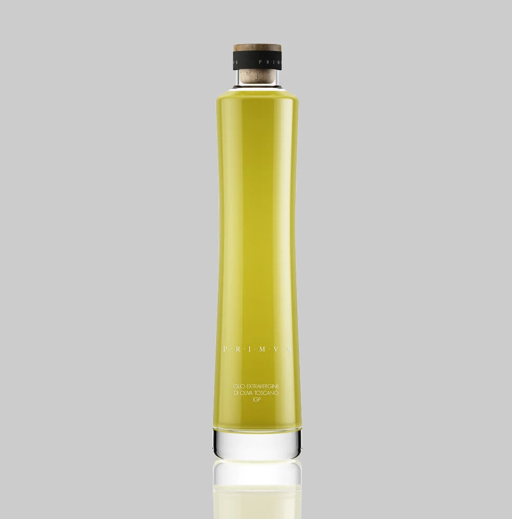
P.R.I.M.V.S intended not only to be at the cutting edge of design for aesthetic purposes but, most importantly, desired that the packaging is of the quality that their discerning clientele would be pleased to have on their tables. Design and form are therefore essential to P.R.I.M.V.S, and their packaging has proprietary bottles and jars that were specially commissioned by the CEO and founder. Absolute minimalism and essentialism are fundamental elements to be seen in the design and communicate harmony, serenity and a fastidious detail to attention on all aspects of the packaging process. The contours and subtle curves lend to functional forms that, whilst dynamic was conceived for the most demanding of discerning clientele.

Organic material such as natural beech wood was utilized — a first in the world for mineral water bottles. Opaque black caps, again a first in food and exclusively studied for P.R.I.M.V.S are utilized and labeling was purposefully silk-screened on the sides of the mineral water and olive oil bottles to ensure that the brand name on the front is visible without distracting elements.

Designed by the Portuguese studio, NTGJ, it strictly abides by P.R.I.M.V.S’ philosophy of “less is more”. With remarkable attention to detail, I especially like the wooden cap, and the very deliberate omission of any superfluous elements to show what is really important through the glass bottle — the contents inside — the best way to present the quality of a product. “

Gillette Redesign - Student

BLADES.jpg
Marketing4_1024.png
Retro-line_1024.png
Aftershave_deo_1024.png
stilleben_medlogo_1024.png


Created by Collab.: Lucas Anderson/Linnéa Andersson/Anton Green/Karin Olafsdottir

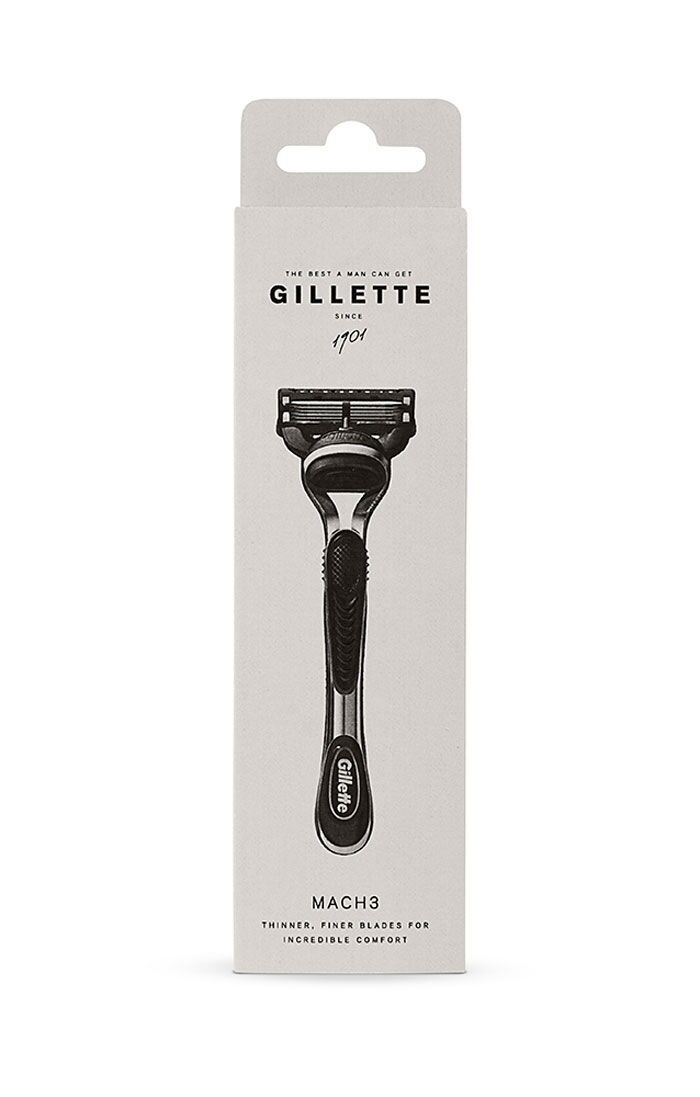
The minimalist trend is set to continue and within the noise of all impressions we experience, people are looking for the simple and human, real and personal. Gillette’s story is worth being told and the design will reflect the quality that lies behind the technologically advanced products.

Gillette’s new packaging is smart, beautiful and a joy to open. The new design is timeless and therefore adapted to a wider audience. It breathes nostalgia along with a modern feel.
As per Gillette's request, this project was used as marketing research on its Facebook page.

Frai Beverages

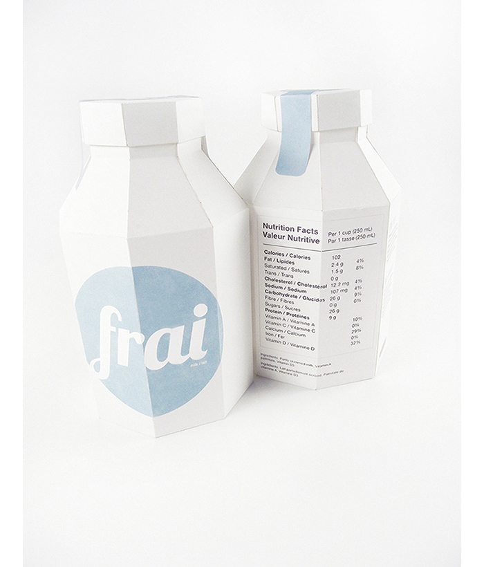
Frai milk and juice cartons is a student project meant for a Canadian audience since the text on the packages is written in both French and English. They are 100% recyclable with a minimal design that allows them to stand out on shelves.Frai is a brand for a series of juice and milk carton designs. These 100% recyclable packages have text in both English and French in order to sell to a Canadian audience. This package series contains a blue milk carton, a brown chocolate milk carton, and a yellow juice carton. The juice carton is taller and thinner in order to differentiate it from my inspiration of an old metal milk container. The minimalist design of the front of the packages will distinguish them on shelves from other current designs.

Created by Cassandra Cappello.