Karma CBD

KARMA-CBD 1A.jpg
KARMA-CBD 2.jpg
KARMA-CBD 3.jpg
KARMA-CBD 4.jpg
KARMA-CBD 5.jpg
KARMA-CBD 6.jpg
KARMA-CBD 7.jpg

Created by blackthornsdesign

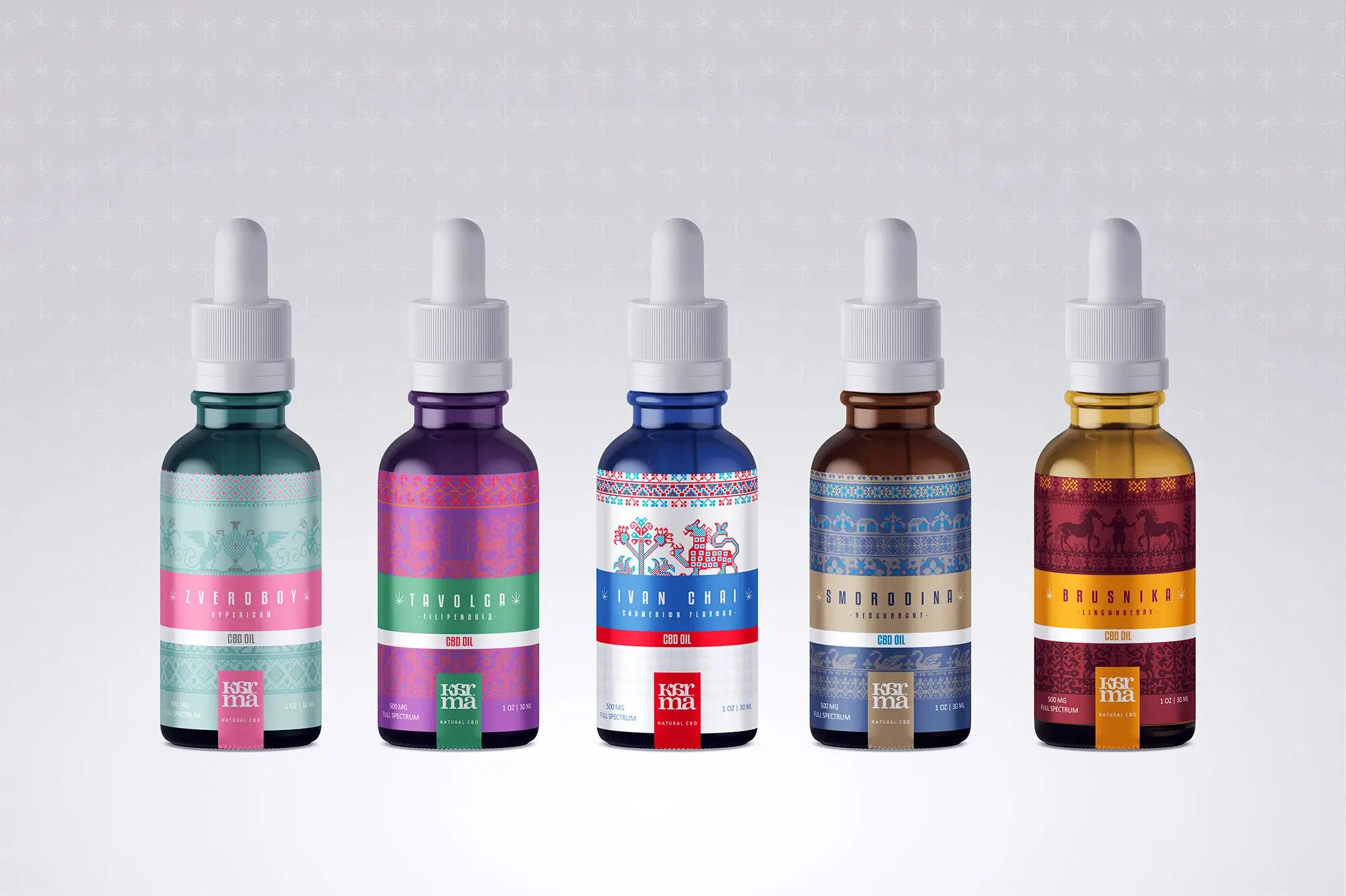
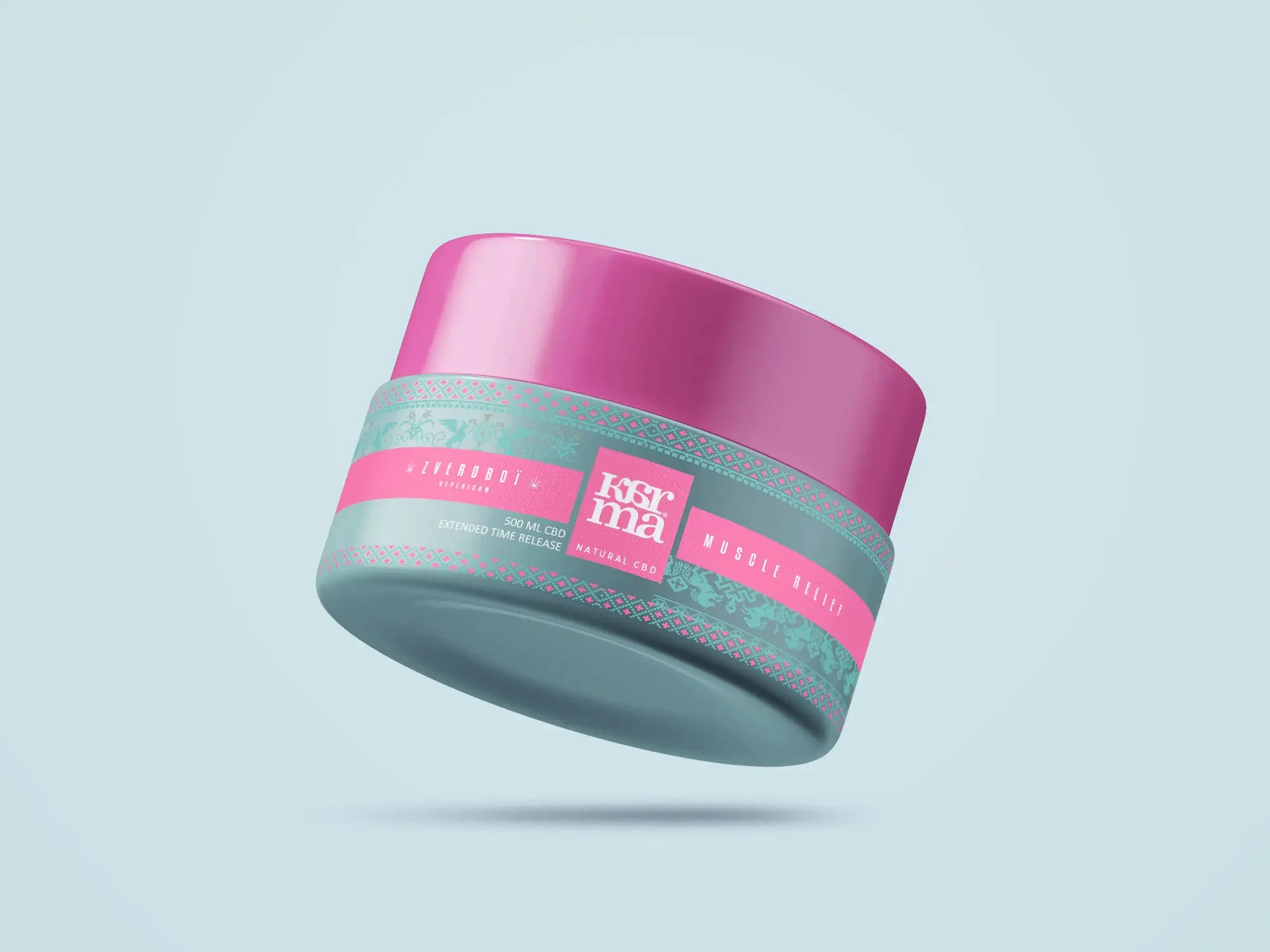
Karma CBD is a brand of conceptual products targeted for the legal cannabis market. This concept of cannabis packaging is based on popular plants used in infusions of Russian teas.

The challenge was to design a line of premium products paying homage to Russian culture.

By combining the aesthetics of traditional Russian culture (illustrations, myths, patterns) with intense use of color contrasts. We have subtly arranged all these graphic elements so as to give a resolutely modern and high-end rendering.

Creating various packaging has been produced: dropper bottles for CBD oils, paper pockets for gummies, care creams.

Ashli Cannabis

Ashli 1.jpg
Ashli 2.jpg
Ashli 3.jpg
Ashli 4.jpg

Created by Process AG

Ashli was created to fill a need in the budding cannabis landscape for a trustworthy, approachable, lifestyle brand to compete with brands like Statemade. 

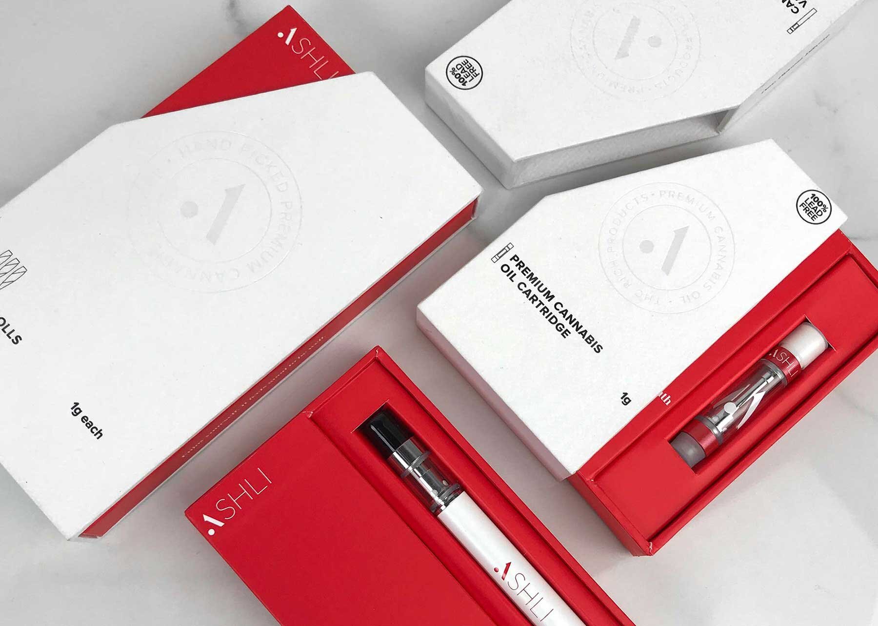
Process set to work defining the brand and then created a unique packaging experience that elevated the perceived value of the product and connected with the target demographic. Ashli is designed for people looking to improve their lives and feel good about themselves.

The identity is modern, clean and sophisticated. We use clean layout and straightforward language- for example, the tagline “It feels good to be well”, speaks to the sincere and honest nature of the brand.

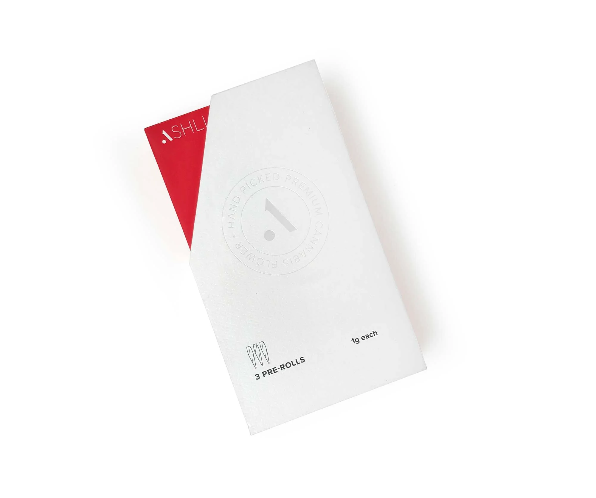
For the package design, we used a seal-like foil stamp to make the identity feel trustworthy, like a doctor’s approval, but we wanted to infuse a more modern lifestyle into the package to ensure it doesn’t feel too medical or bland. We did this by exposing the inner box with a unique die-cut that accents the logo design. We also used two different paper materials to create a soft memorable feeling when you hold the package.

The end result is both effective on a retail shelf and in the consumers’ hands.

This box features two types of paper, textured uncoated paper, and smooth matte coated paper, a pearlescent foil stamp, and a sticker appliqué for itemization, all encompassed on two separate turned edge paper over board boxes, one of them with a special die-cut to reveal the inner box.

Elyon Cannabis

elyon-1-hero.jpg
elyon-eye.jpg
elyon-3-float.jpg
elyon-4-flat-2.jpg

Created by SIXABOVE

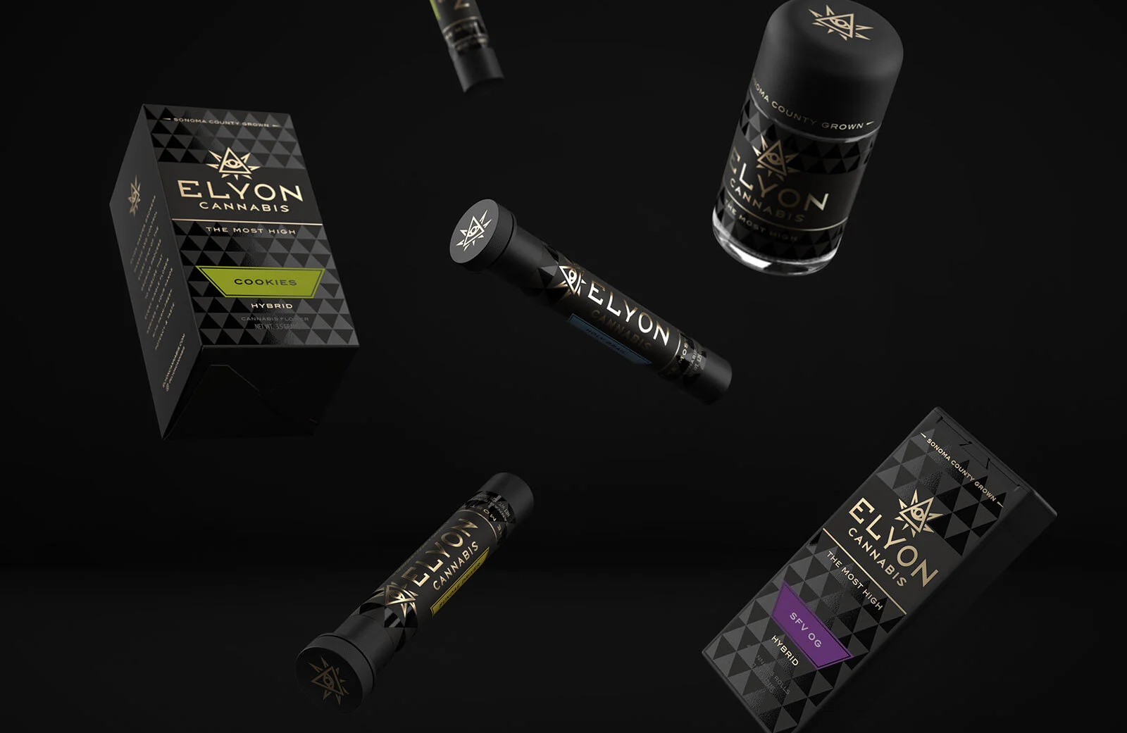
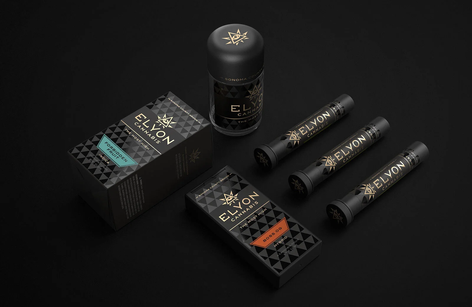
“ Elyon is an emerging cannabis brand nestled in the vineyards of Sonoma County, California. We created the brand identity and packaging design for Elyon Cannabis and its initial product launch. Conceptually this brand was focused on the name Elyon, which is a godly epithet from Biblical Hebrew translating to “most high. The logomark was created combining a cannabis leaf with the iconic All-Seeing Eye of God, an image often associated with the Illuminati. The rays, typically accenting the Eye, were used as inspiration in incorporating the cannabis leaf. Resulting in a unique, transient mark. The supporting pattern and design elements, created for the packaging, harken back to the logomark’s sharp angles, establishing a simple yet sophisticated look. The use of gold foil and UV gloss were utilized to enhance the consumer’s experience, while further perpetuating the brand’s esoteric tone.

Manali West Premium Cannabis

Manali-Portfolio-Image_03_01_White.jpg
ManaliLogoFoil2500.jpg
Manali-Portfolio-Image_02_01_Green.jpg
LegendIcons.jpg
Manali-Portfolio-Image_01_03_Cream_2500_PX.jpg

Created by Miller

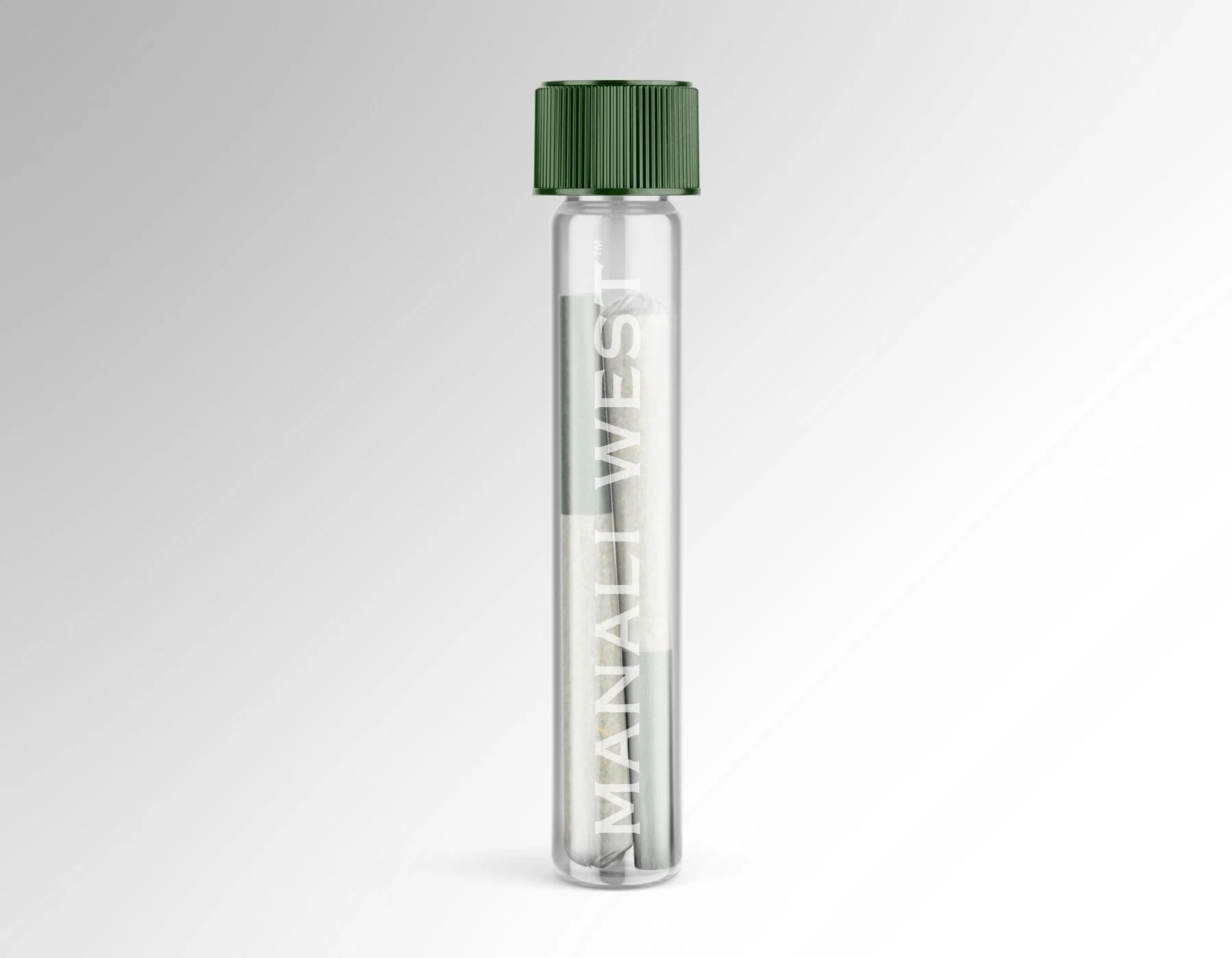
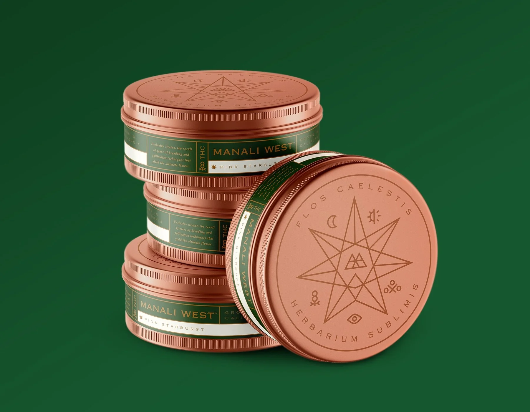
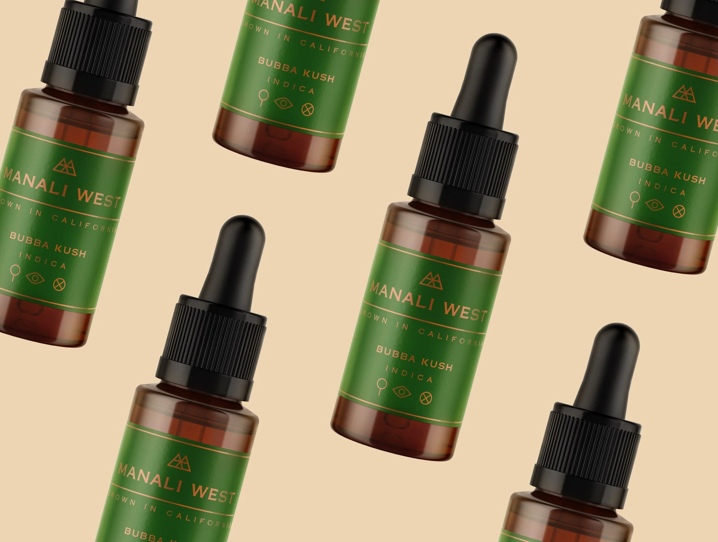
“ Manali West is a California cannabis grower with unique, high-end cannabis flower strains. We developed a cannabis branding system to reflect the premium aspect of this exclusive brand.

A color palette of deep green and burnished copper lends a luxe vibe to this cannabis branding system. Consumers seeking a premium cannabis brand will understand that Manali West is among the best available, through luxurious cues that one would expect from a high-end consumer brand. “

Henrys Original

Pavement_Henrys4.jpg
Pavement_Henrys3.jpg
Pavement_Henrys2.jpg
Pavement_Henrys1.jpg

Created by Pavemant

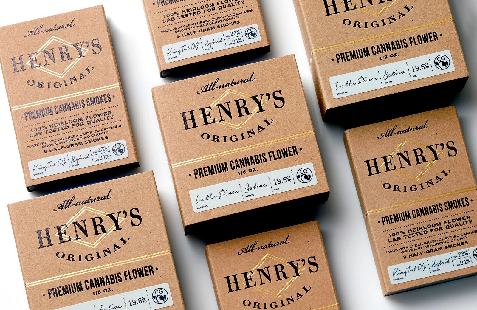
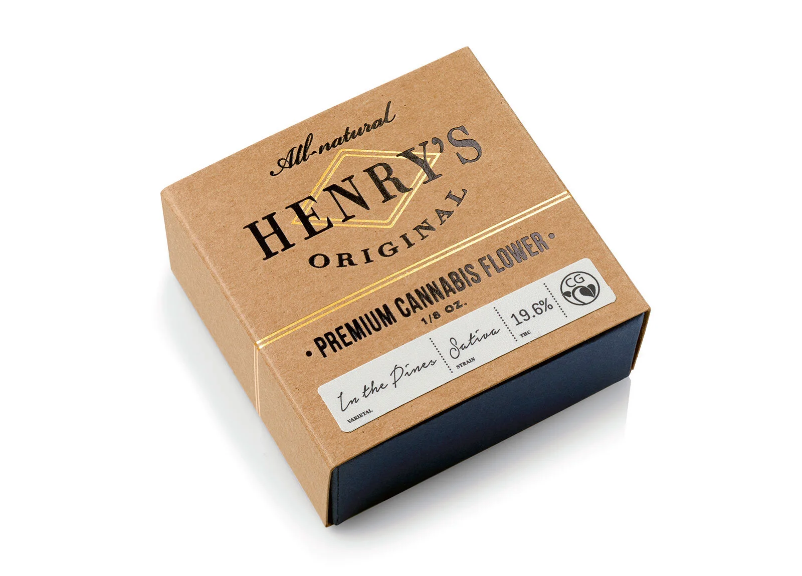
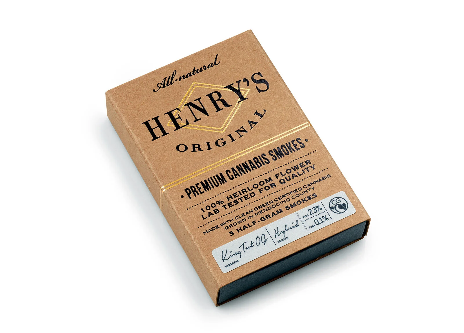
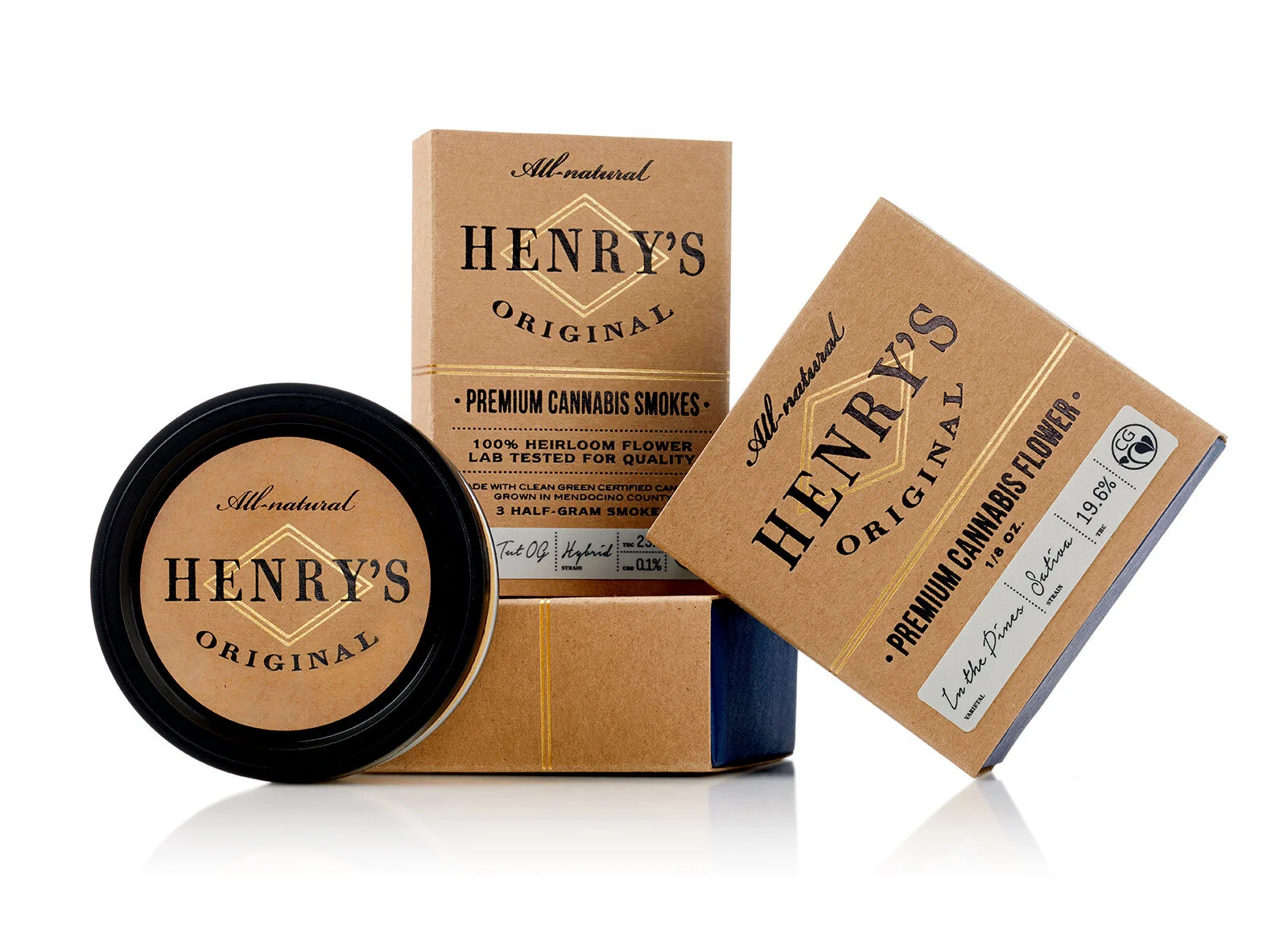
“ Henry's Original is the finest cannabis grown under the strictest of standards. Henry's founders pride themselves as real farmers—the kind who can spot a plant from 100 feet away and know what it needs. The kind of farmers who can feel the winds shift and know how much time until the rain rolls in. With this kind of attention to detail in mind, the goal was to create a brand that reflected the quality of the products and the modest nature of its founders. Reminiscent of vintage apothecary labels, an unassuming brand was crafted that focuses on communicating the superior quality of Henry's Original heirloom cannabis. Custom box structures constructed of natural papers and fine gold foil details lend a sophisticated appearance to this unpretentious brand. “

Canna Chocolade

key_image_cannachocolade-1.jpg
1_cannachocolade-1.jpg
5_cannachocolade-1.jpg
4_cannachocolade-1.jpg

Created by CornStudio

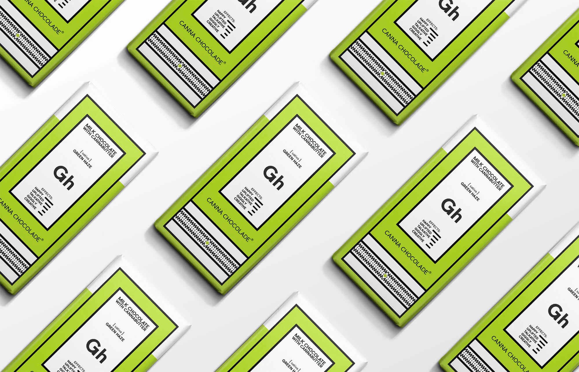
Milk chocolate with cannabutter:

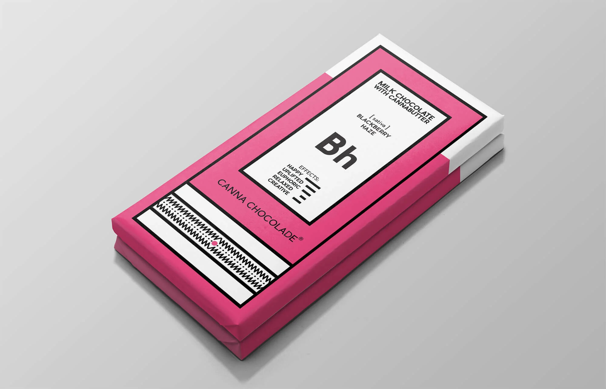
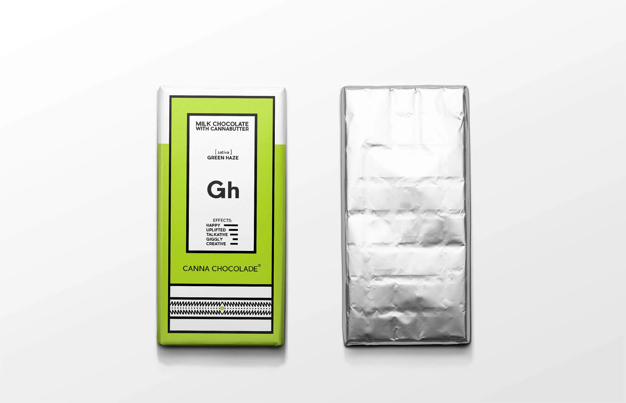
The challenge: Canna Chocolade is a conceptual chocolate brand that produces milk chocolates made with cannabutter (cannabis butter). Each chocolate is made with cannabutter from a different haze variety and has unique effects. For example, if you eat the Blackberry haze chocolate, you will feel very happy and uplifted! If you want to feel euphoric then you should try Purple haze, and so on. Of course, this is a self-initiated concept project, but we would really like it to be real!

The concept: We designed the identity and packaging for four different flavors. To distinguish them from any other chocolate, we gave them a geometric look & feel, but also a more psychedelic character because of their special ingredient. Each chocolate has its own name and a symbol drawn from its initial letters. For example, Green Haze is “Gh”, all inspired by the periodic table.